This was the first time I had ever done a printmaking project and according to all the people who gave me feedback (so about four people), they all said I was pretty good at it. Actually placing the print down was difficult at first because the print tends to slide and throw off the colors. After a couple prints, I sort of got the hang of it.
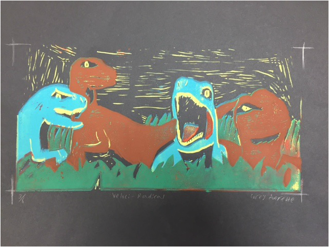
The main themes of this project were ancient architecture/ wonders of the world and prehistoric times. So I couldn't find many great ideas for architecture and the ones that I did seemed difficult. So I went with raptors. And who doesn't like raptors? ......Okay, a lot of people. But the point is that they were easier to draw and, frankly, more fun. Besides, dinosaurs make everything better. The pictures I used for inspiration were mainly from Jurassic Park, because where else would I get them from?
My two major problems during this project were the placement of the prints and not cutting enough of the print away. I already talked about the print sliding and all I could do for that was to just keep printing. My solution for the second problem was to just make the best of it. For example, the yellow lines in the background. Those weren't supposed to be there, but I thought they made it look more interesting, so I kept them.
On the technical side, I like the use of space in the print because nowhere does it seem empty. While this piece isn't perfect, prints don't have to be. The yellow lines in the background were an accident, but they make the background interesting. The idea process was pretty standard for me. A week later I actually started. When we were told one theme was prehistoric eras, I knew that if I was going to use a dinosaur, it'd be a raptor. As a whole, the print was one of my best projects this semester and, honestly, it kind of came out of left field.
 RSS Feed
