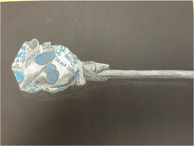
This is a prismacolor lollipop that I had to draw. We weren't allowed to use black, so I had to use white to shade and I really like how it turned out.
|
|
|
|
This is a prismacolor lollipop that I had to draw. We weren't allowed to use black, so I had to use white to shade and I really like how it turned out.
0 Comments
 I Create Original Art
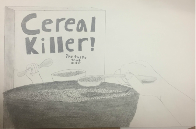
This is definitely the kind of picture that fits into my own style. It looks good and it's meant to have some humor to it. I don't know of many other people who would make a picture like this. Does art always have to be serious? Of course not! As long as effort is put in, why can't it be funny? I Take Risks Before starting the final, I wasn't sure how good the cereal was going to look. But, seeing as I didn't have many other good ideas, I just decided to risk it. In the end, I feel like it payed off. I think the cereal looks pretty good, even though it is a bit small on the left side. I Developed My Art Making Skills Once again, for this project I used pencil and I feel like I'm still improving with it. I think the shading looks really good, especially on the shadow of the spoon. And again, I really like how the cereal looks. As a whole, this is probably my best pencil piece yet. 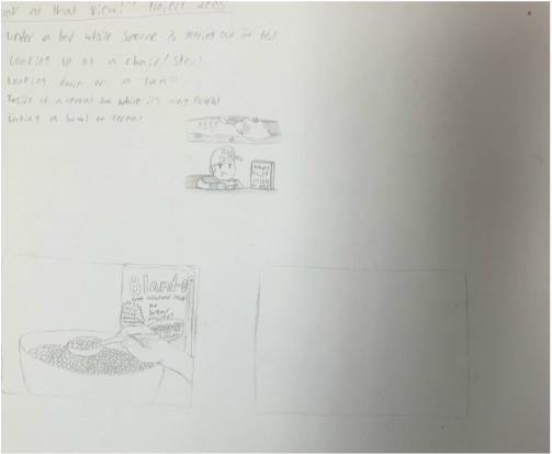 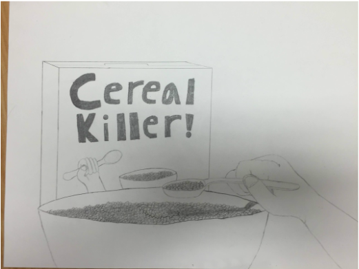 These are my sketches and in progress picture for the "Look at that view!" project. I like what I did with this project. It looks good and it has the added humor that I always enjoy having. And yes, I'm not very good at getting the right amount of sketches, but I liked the idea and went with it.
(And don't ask about the drawing next to the ideas) 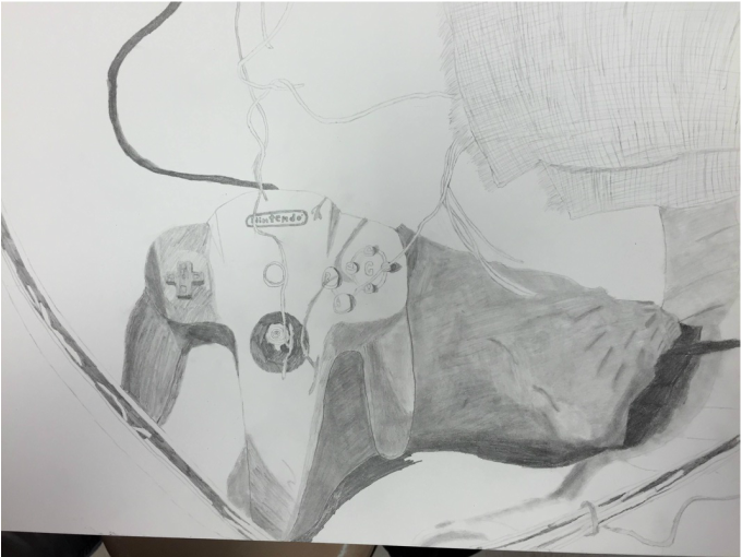 I Developed My Art Making Skills
With this project, I used pencil, which is something I use in drawings near constantly. Even though I use pencil a lot, I'm still not perfect at it. In this project, I worked on improving my shading, which is something I struggle with. After this project was over, I felt like I had gotten a bit better, but I still have a ways to go. I Solve Problems When I was working on this, I noticed that the controller and shell were both stretched out and they looked a lot bigger than they were. But by that point, I was too far in that I couldn't restart. So instead I just tried to make the best of it. Looking at it without seeing the actual still life, it isn't too noticeable. I Take Risks I took a risk by choosing to draw these objects. I chose to draw these mainly because the Nintendo 64 controller was the most interesting object in the still life. Although that meant that I had to draw the shell and basket. Drawing a shell in Art 1 didn't work out very well for me and the basket was full of shadows that required a lot of shading (unfortunately, I didn't get to finish the shadows.) 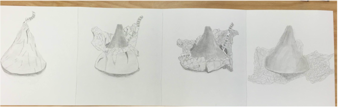 For this project, we had to draw a piece of candy being unwrapped in four different stages. I decided to draw a Hershey Kiss. I really like the two pictures in the middle because I think the wrinkles on the wrapper look really good on those two and because the chocolate looks better than in picture 4.
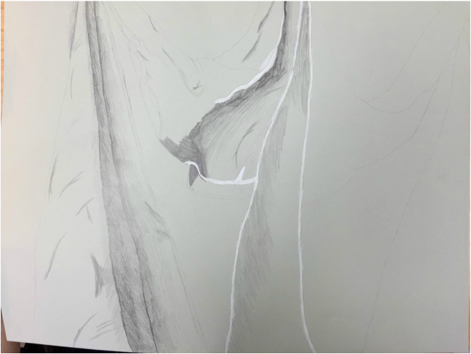 Once again, I ran out of time on this. I know that this is the project people learn the most from, so hopefully that happens at some point. Maybe if I stare at it for a couple hours...
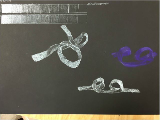 For this mini project, I had to choose between prisma colors and white charcoal to draw a ribbon of paper. Since I will eternally dislike charcoal, I chose prisma colors. And, of course, I unintentionally bent the ribbon in the strangest possible way. But at least the purple one looks pretty good to me.
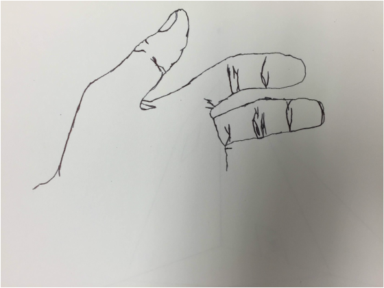 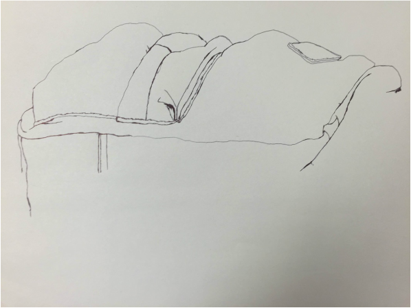  These are a few of my contour line drawings. The first is a modified contour drawing of my hand that I had five minutes to do (unfinished). The second is a drawing of a backpack (unfinished). The last on is a drawing of one of the corners of the room (unfinished- I'm starting to detect a pattern here...)
So I'm not great at finishing these drawings, but at least they look good, right? 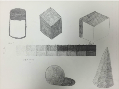 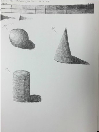 These are some shapes that I shaded as well as some value charts. As you can see, some of the shapes in the first picture aren't done.
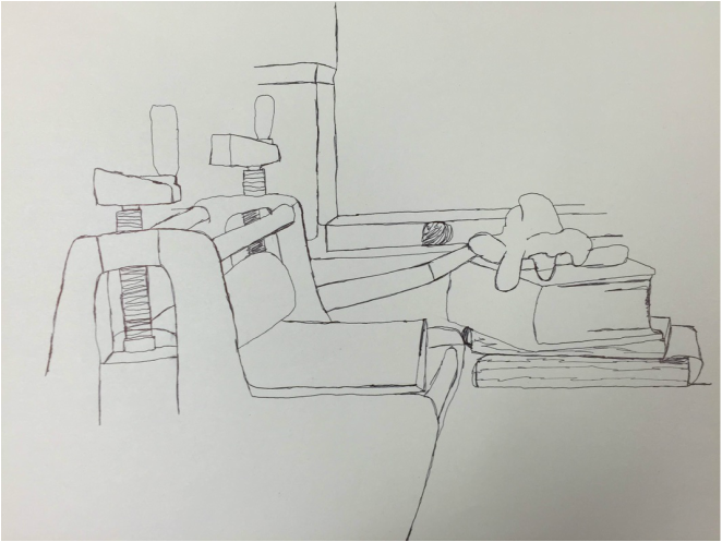
(Also I'm not sure which is for Art 2 and which is for drawing, so I put them both here.) |
AuthorSomething about yourself. What? That's what it said. Archives
January 2016
Categories |
 RSS Feed
